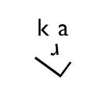

 So, here are a selection of new birthday cards that I have designed. As you can probably tell from the second image, the top of the P and Y perished away whilst printing which I was quite upset about. But I carried on printing regardless. In a way, I am feeling slightly rebellious and I am going to use wooden type that DOESN'T leave a perfect impression. I personally thin that it gives more character to the print. I don't know? Maybe that's just my strange design style!
I wish I had more inks that I could play with but at the moment I only have the green. These were printed on to a 400mic (around 300gsm) white pulb board. It prints beautifully and leaves a small but effective impression on the paper.
I have purposely left some of the letters out so that I could fill them in myself. I plan on merging letterpress and illustration/hand rendered typography. I would like to sell cards this way. maybe even sell some blank for those who are like minded, to fill in the gaps themselves.
